Opening Xcode Out of Spite
In my previous post, I left you in a digital purgatory: standing in the rain, frantically deleting photos of my dog just to make room for a work invoice.
That was the day "Storage Full" stopped being an inconvenience and started being an insult. The "Phone Cleaner" market was a graveyard of scammy subscriptions and blind algorithms that couldn't distinguish a blurry pocket-shot from a blurry memory of a late grandmother.
So I did what any developer with zero free time and mounting spite does: I opened Xcode.

1. The "No-Library" Manifesto and the SwiftUI Gift
My first rule: a No-Dependency policy. Every third-party library is a potential point of failure — a black box that can break when a new iOS beta drops. I wanted a lean, native auditing engine.
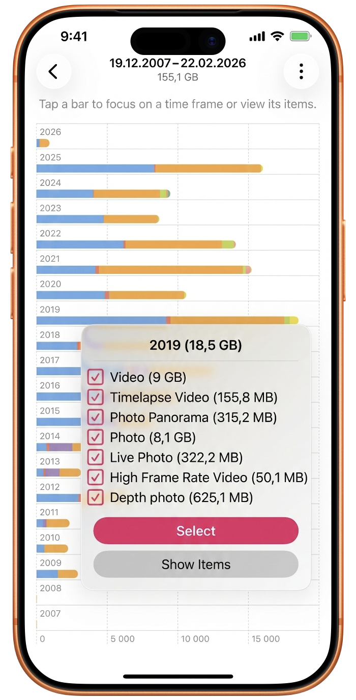
The problem: I needed to visualise 14,000 photos in a way that didn't look like a spreadsheet. I wanted a map of storage. As if on cue, Apple released SwiftUI Charts. I built a visual heartbeat of a user's library using native SwiftUI Plots — mapping years of data into interactive landscapes that showed exactly where the bloat lived. That three-week trip to Japan? That burst session with the cat? By staying 100% native, I kept the footprint tiny while giving users a God-mode view of their data.
2. The Performance Wall: Why "Holistic" Analysis Is a Trap
My first architectural draft ran a deep-dive pixel-level analysis on the entire library at once.
The result: the app stayed on the "Scanning" screen for forty minutes.
I had to pivot to a Tiered Analysis. We start with the "Metadata Lens" — scanning file sizes and media types in seconds. This lets the user immediately see which time clusters are the biggest offenders. Only once they zoom into a specific event does the app fire up the heavy pixel-level analysis. This tiered flow makes the app feel instantaneous while hiding the massive computational work happening under the hood.
3. The Plot Twist: The "Unlimited" Data Lie
Three months into development I was testing a build on the train when my carrier sent a terrifying text:
"You have reached your high-speed data limit."
I have an unlimited plan. I was baffled.
Then I realized: even though Photosweepy is 100% on-device, the Photos Framework is a sneaky beast. If you have "Optimize Storage" turned on, your high-res originals aren't on your phone. When my app asked to analyze a photo's blurriness, iOS was silently reaching into the cloud, downloading the original, and burning cellular data.
The fix: I implemented Offline Mode — a logic gate that checks for local residency of each asset. If you're on cellular with Cloud Fetch disabled, Photosweepy skips deep analysis for non-local files. A humbling lesson: even when you build for privacy, the OS will try to "help" you into a data overage.
4. The Honeymoon Problem: When "Beauty" Is Subjective
I wanted a Neural Engine to preemptively score photos and suggest deletions. Then I showed the prototype to my wife.
I showed her a photo from our honeymoon. To my algorithm — and honestly to me — it was trash. Her hair was flying in her face, she was mid-blink, a tourist was walking through the background. I had 29 other photos of that exact moment that were technically perfect.
She hated the good ones. She loved the trash one.
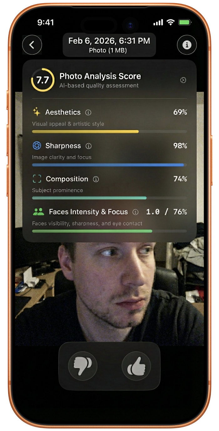
This killed the "Delete" button. Instead I introduced Thumbs Up and Thumbs Down. I took the NIMA (Neural Image Assessment) model, stripped and re-wired it using non-Apple tools to make it compatible with Core ML, and transformed it for in-app iOS use. Now the app doesn't tell you what to delete — it learns what you like.
5. Metrics Over Magic: Solving the Burst-Shot Paradox
Aesthetic scoring alone wasn't enough. When you have 30 visually similar honeymoon photos, "beauty" is too vague. I needed hard data, so I introduced Photo Quality Metrics:
- Face Detection — are the eyes open? Is the smile genuine?
- Blur and Saliency — is the subject in focus, or is the background stealing the importance of the shot?
When you're looking at two identical sunset shots, Photosweepy gives you the metrics to decide. It's not a robot making the choice — it's an engine giving you the evidence to make the choice without Delete Dread.
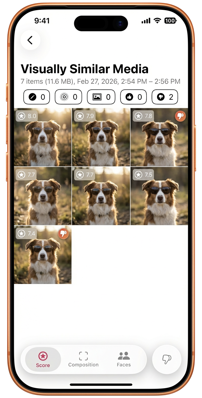
6. The Secret Sauce: Visual Similarity at Scale
Identifying visually similar photos — not just exact duplicates, but similar shots — is a performance nightmare on a server. On an iPhone without draining the battery, it required a custom clustering algorithm I still keep as my secret sauce.
It finds those 30 honeymoon shots, groups them, and says: "Hey, you have 400 MB tied up in this 10-second moment. Pick your favourite and get the rest back."
7. Hunting the Space Ghosts
Finally, the Media Classifications:
- Videos are the obvious villains
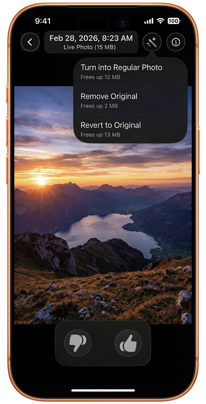
- Live Photos are Space Ghosts — they look like one photo but hide a 3-second video file
- Edited Photos keep the full original hidden in the background "just in case"
I built tools to strip these hidden resources. You can keep the photo but kill the ghost. The space comes back; the memory stays.
8. The Modern Coat: SwiftUI in 2026
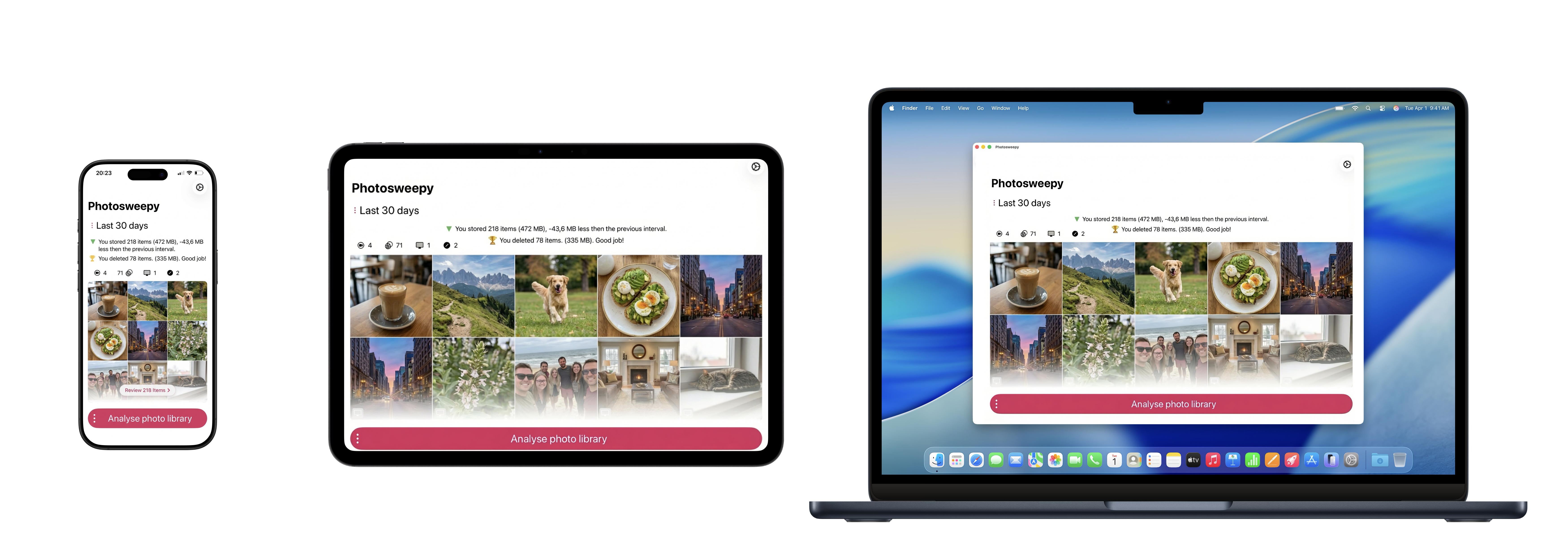
I wanted this app to be a first-class citizen on iOS, iPadOS, and macOS. Using the latest SwiftUI "Liquid Glass" effects and gesture-driven UI, I made auditing your photos feel as fluid as scrolling through social media — swipes, pinches, and long-presses that turn a chore into a flow state.
A Labor of Love and Logic
Photosweepy isn't an app I whipped up in a weekend. It represents years of development, thousands of hours of real-life testing, and constant validation from users who were as tired as I was of fighting their own devices.
Behind every line of code is a commitment to a simpler life — to bridge the gap between digital hoarding and digital curation. To create a tool that lets you manage your media with love and precision, rather than hate and frustration.
The "Storage Full" nightmare is over.
Download Photosweepy and reclaim your first 5 GB without deleting a single visible photo.